What does mapping the path of actress Jean Harlow’s wandering beauty mark tell us about about beauty and 1930’s Hollywood? How does a matrix of tiny onesies and short pants illustrate the trauma of day care deaths? And why does a week-by-week chart of a typical American life remind us, far more than a paragraph about life expectancy, that our time is finite?
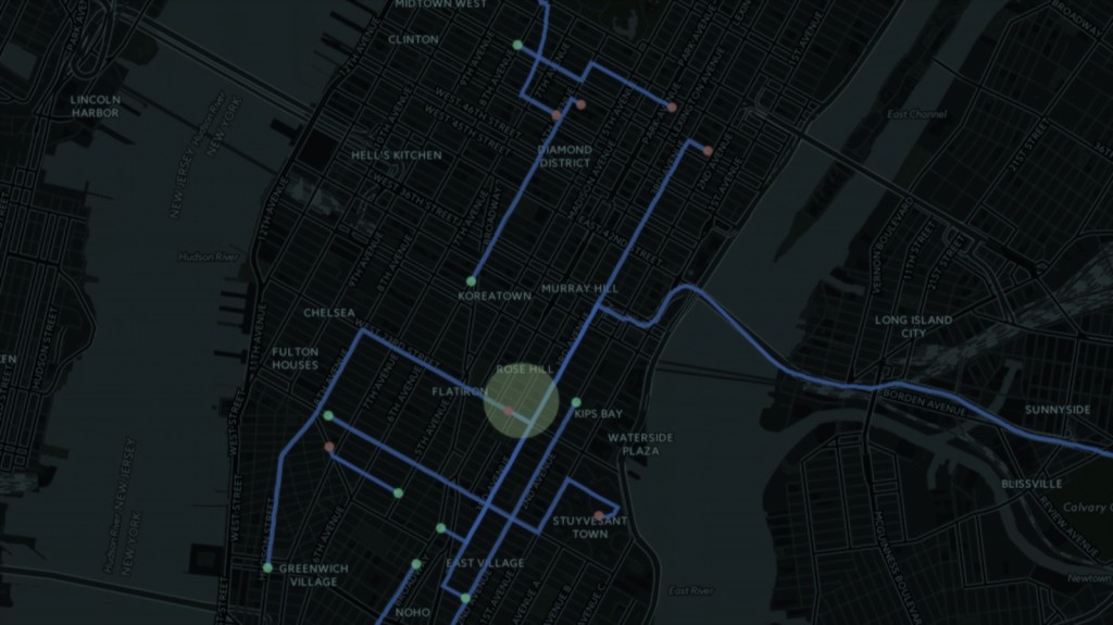
These questions and more are pondered in a collection of fascinating infographics — including the one pictured above, which tracked a day in the life of a New York City taxi — edited with style by New England science writer and Pulitzer-prize winning journalist Gareth Cook. Part of Houghton, Mifflin, Harcourt’s “Best American” series, the book, The Best American Infographics, 2015, along with The Best American Comics, focuses on the power of graphic communication.
The series makes a case that a great infographic is able to communicate an idea not just quicker than words, but sometimes more completely as well. Infographics are a vivid way of illustrating relationships between our individual and collective lives. As Maria Popova, of the widely read blog, Brain Pickings, states in her introduction, “Knowledge lives in this relational understanding, and a great infographic accomplishes just that.”
Gareth Cook will speak about graphic story telling and his book series at the Knight Science Journalism Book Night on Thursday, February 18. There are a limited number of seats available to the general public. Please contact Eric Strattman at ejstratt@mit.edu, if you’d like to attend.


Leave a Reply